Cover designs are always one of the more challenging things to work on as a book designer. If I’m lucky one of my first designs will win out and end up printed . . . but usually not. It can take hundreds of cover options before we land on one that wins out, and even then, we sometimes circle back to one of our original ideas.
The difficulties of cover design mostly lie in how many people are involved in the approval process. For us this always includes the designer, editor, author, art director, editorial director, and the sales/marketing team. It also includes feedback from reps at companies like Amazon and Barnes & Noble—they can have very strong opinions!
As a designer, having this many opinions to grapple with can be frustrating at times. But ultimately everyone is pushing for the best possible visual representation of the book. Sometimes the only way to get there is to be forced past all the most obvious ideas. Freefall Summer’s cover had many iterations before turning into what it looks like now (but not as many as some other books).
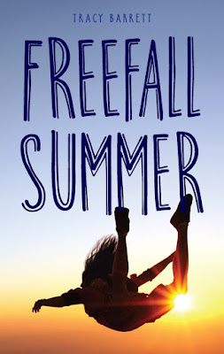
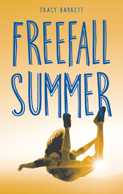
By the time I started working on this title, many cover options had already been proposed and turned down. Below is a selection of my cover designs that didn’t make the final cut:
As you can see, on the right I found what would end up being the cover image fairly early on. The image on the left was a more clearly about skydiving and there was a lot of debate about how obvious this needed to be.
We tried a script font, but our in-house sales/marketing team pointed out that it made the cover feel too romantic, and we didn’t want to pigeonhole such a dynamic story that way. The editor and I also made the choice to drop “My” from the title, with permission from the author.
This was the next iteration I proposed—to almost unanimous in-house approval! I was thrilled, the editor was thrilled, and we ended up printing this cover on the advanced reader copies (ARC). But as often happens, shortly after the ARCs were printed we heard back from the sales account reps. The consensus: It looked too religious, like a spiritual self-help title. Once we heard that no one could un-hear it (or un-see it!).
We didn’t want to go completely back to the drawing board at this point—we decided to keep working with the same image and tried approaching it differently.
I tried two new type treatments. Sales/marketing felt the script made it feel too feminine, similar to the “romantic” feeling script I’d tried earlier in the process. Everyone loved the second type option (bottom), a font called “Breakfast Burrito” by David Kerkhoff. (Don’t you just love typeface names?!) Though many people liked the more monochromatic options for the cover, ultimately the full color image won out.
With just a little more tweaking, four months after I started working on it, we landed on the final cover:
Covers are a lot of work. Sometime they’re fun; sometimes they’re not. But they’re always a fascinating opportunity, as a designer, to learn about how to best visually approach a specific audience—it’s very different for every book!


2 comments:
This is such a cool process. And, I LOVE the cover for this book!
Thank you, Julie!
Post a Comment