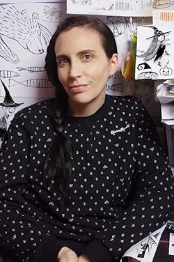
When I received the manuscript, the first thing I did was to read it several times while doodling everything that popped into my head (and laughing out loud!).
At this stage when I work on a picture book, I usually do character designs. In this sequel of Poppy’s Best Paper, there were three new characters: the baby twins and GeeGee, Poppy’s Grandmother. The twins were easy to design, as they are a mix of Papa and Mama. GeeGee came easily too. In my opinion, Poppy and GeeGee have a particularly strong tie because they share the same kind of big personality: energetic, rebel, creative and whimsical. So I immediately saw GeeGee as a hard rocker, a kind of pirate for Poppy.
Here came my favorite part: thumbnails and sketches. I storyboarded the whole story, trying different compositions through very rough tiny sketches.
When I determined what worked best, I did more detailed sketches at full-scale with text.
Once all the sketches were approved by the team, I went on to the final art. For Poppy’s series, I wanted the illustrations to look a bit vintage. So I used a specific technic. After doing and inking the final drawings, I rubbed down them with sandpaper.
I scanned and I added materials with Photoshop (clothes, wallpapers and floors). I used materials that I had previously scanned or photographed (brick wall, linen textile, knitwear…) and materials that I designed especially for the book.
Here is a sneak peek of the final art:
A few weeks later, I did some digital finalisations on the high resolution scans (snowflakes, stars and dark of night). The team also asked for a few corrections as, for example, to make GeeGee’s face less scary here, ha, ha, ha!
Once the final art was approved, I looked for cover ideas. The image had to be eye-catching, but also it had to work with the cover of the previous book, Poppy’s Best Paper. Below, my first ideas:


No comments:
Post a Comment